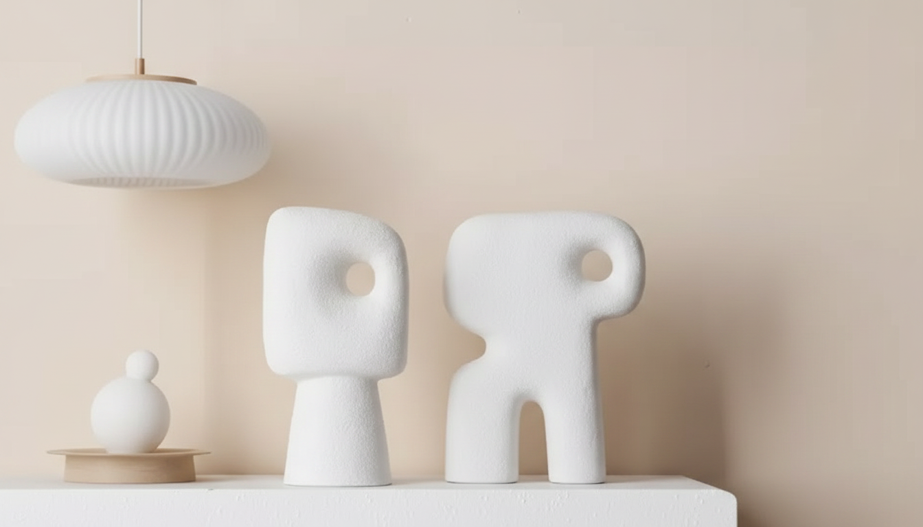
A ceramic abstract people figurine brings quiet character to a room without adding visual clutter. With softened forms and a matte sculptural feel, it fits naturally into Nordic-inspired interiors—especially on shelves, console tables, and mantel displays where small details set the tone. The human-inspired silhouette adds warmth in a subtle way, making it easy to style with everyday essentials like books, baskets, and a simple vase. For more guidance, see Inside the Ideal Home: The Changing Values of Apartment ….
If you’re building a calm, lived-in look, a single sculptural object can do more than a dozen smaller trinkets. Nordic styling leans on restraint, honest materials, and clear shapes—principles closely tied to Scandinavian design traditions (see Encyclopaedia Britannica’s overview of Scandinavian design). Ceramic as a medium also plays well here: it’s tactile, timeless, and sculptural by nature (explore the Victoria and Albert Museum’s ceramics overview for context on the material’s range and appeal). For further reading, see A Style of Their Own: Upper Midwestern Rosemalers.
What makes an abstract ceramic figurine work in Nordic interiors
- Simple silhouettes that read clearly from a distance, even on open shelving.
- Neutral ceramic texture that pairs with wood, linen, glass, and stone without competing.
- Human-inspired form that adds warmth and presence without feeling busy or themed.
- A natural “pause point” between books, frames, and plants, helping reduce visual noise.
In practice, the best abstract figurines feel almost architectural: they provide shape and rhythm, but they don’t demand a bold color story. That’s why matte ceramics and softened contours are so effective on shelves—your eye can rest on them.
Where to place it for the best effect
- Living room shelf: Set slightly off-center and leave negative space around it for a gallery-like look.
- TV console: Place near a stack of books or a tray to create a layered vignette.
- Entryway: Pair with a catchall dish and a small lamp for a welcoming first impression.
- Mantel: Balance it with one tall element (candlestick or vase) and one low element (book or bowl).
Placement ideas and quick styling pairings
| Spot |
Best companion pieces |
Styling tip |
| Floating shelf |
Books, small frame, mini plant |
Keep 2–4 inches of empty space around the figurine to let the form stand out |
| Console table |
Tray, candle, bowl |
Use a tray to visually “anchor” small objects into one grouped moment |
| Bookcase |
Book stack, vase |
Place the figurine in front of a few books to add depth |
| Side table |
Lamp, coaster set |
Keep other decor low-profile so the figurine reads as the focal point |
Color, finish, and texture pairings that feel cohesive
- Warm neutrals (sand, cream, taupe) pair well with oak, walnut, and beige textiles.
- Cool neutrals (white, gray) complement black accents, concrete, and smoked glass.
- Matte ceramic looks especially natural next to linen, bouclé, and raw wood grain.
- One contrasting material (brass/black metal or glossy glass) can add a modern edge without disrupting the calm.
A helpful rule: keep the palette tight, then add interest through texture. Ceramic offers a soft, chalky surface; wood offers grain; linen offers slub and weave; glass offers reflection. Together, they create depth while staying quiet.
Size and proportion: getting shelf decor to look intentional
- Use the “triangle” approach: one tall item, one medium item (the figurine), and one low item.
- Stagger levels: avoid lining objects up at the same height; use books or risers to vary the skyline.
- Group in odd numbers: 3 or 5 items feels relaxed and curated.
- Create rhythm on long shelves: repeat the material once (another ceramic piece) so the styling feels planned, not random.
Scale is often what separates “decor on a shelf” from a cohesive vignette. If the shelf is deep, move the figurine slightly forward to avoid a flat, back-row lineup. If the shelf is shallow, keep surrounding items slimmer—think frames, a small bud vase, or a compact candle.
Care and everyday maintenance
- Dust weekly with a soft, dry microfiber cloth to keep the ceramic surface clean.
- For smudges, use a barely damp cloth and dry immediately to prevent water marks.
- Avoid abrasive cleaners that can dull matte finishes.
- Keep away from shelf edges in high-traffic areas to reduce the chance of bumps.
Ceramic is durable, but matte finishes look best when treated gently. If you style near a kitchen or an entryway, a quick wipe-down keeps the piece looking crisp against light walls and pale wood.
A simple shelf vignette recipe (fast to set up, easy to refresh)
- Start with a base: a small tray or a short stack of books.
- Add the figurine: place it as the sculptural centerpiece, slightly forward from the back line.
- Introduce one natural element: a small plant, dried stems, or a textured bowl.
- Finish with warm light nearby: a table lamp or candle softens the ceramic contours at night.
Shop Nordic-friendly accents (in stock)
FAQ
How do ceramic figurines fit into a minimalist living room?
A single sculptural ceramic piece adds warmth and personality without clutter. Leave negative space around it and pair it with neutral textures like wood, linen, or stone so the form reads clearly.
Can a ceramic decor figurine be placed near a window or sunlight?
Ceramic generally handles light well, but keep the figurine stable to avoid accidental knocks when opening blinds or windows. Areas near windows may need more frequent dusting, especially on matte finishes.
What should be displayed next to an abstract people figurine on a shelf?
Books, a small vase, a candle, or a framed print are easy companions. Vary heights and keep the palette limited so the figurine stays the focal point while the surrounding pieces add balance.
Recommended for you









Leave a comment