A David-inspired sculpture brings instant museum energy to a room, but the most striking versions don’t rely on size alone. A black-and-white base with gold accents turns a classic form into a contemporary object—ideal for consoles, bookcases, desktops, and curated gallery walls where contrast and shine matter. Referencing one of the most recognizable silhouettes in art history, it nods to tradition while styling like a modern collectible. For background on the original masterpiece, see the Galleria dell’Accademia di Firenze and Encyclopaedia Britannica. For more guidance, see Case Study: Michelangelo’s David – Chedar.
Why a David-Inspired Sculpture Feels Timeless
Some décor trends come and go, but classical sculpture keeps returning because it’s built on proportion, balance, and a silhouette that reads instantly. A David-style figure doesn’t need to dominate the room to feel important; it creates a focal point through form alone. For further reading, see A fight to protect the dignity of Michelangelo’s David raises questions ….
- Classical proportions and a recognizable outline make it a focal point even on smaller shelves.
- It bridges styles easily: modern minimalism, eclectic maximalism, glam, and monochrome interiors.
- It pairs naturally with architectural cues—arches, columns, pedestal stands—and with art books.
- Placed with intention (and good lighting), a smaller sculpture can echo the impact of larger art.
What Makes the Black, White, and Gold Finish So Versatile
Color and finish do a lot of the work in modern interiors. Black and white deliver crisp, graphic contrast that reads cleanly from across the room, while gold details add warmth and a touch of luxe. Together, they feel bold without being hard to coordinate.
- Black and white create high-contrast clarity—especially helpful on busy shelves or gallery walls.
- Gold accents complement brass hardware, warm-toned frames, and soft ambient lighting.
- Neutral base tones make seasonal swaps easy (greens in spring, terracotta in fall) without clashing.
- The look stands out against walnut, white oak, marble, concrete, and matte painted walls.
Easy Pairings by Room Palette
| Room palette |
Best placement |
Materials that match |
Extra styling touch |
| Warm neutrals (beige, sand, taupe) |
Console or shelf at eye level |
Brass, travertine, walnut |
Add a single stem in a tall matte vase |
| Monochrome (black/white/gray) |
Bookcase vignette |
Chrome, lacquer, marble |
Use a black plinth for a gallery feel |
| Earthy modern (olive, clay, terracotta) |
Sideboard or entry table |
Aged brass, rattan, linen |
Add a textured tray to ground the shine |
| Dark moody (charcoal, navy) |
Spotlit corner pedestal |
Smoked glass, dark oak |
Aim a warm accent light to catch the gold |
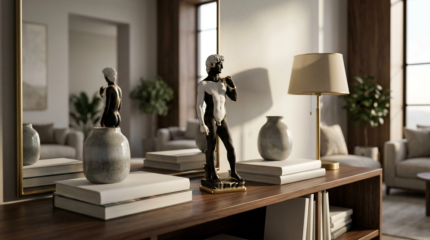
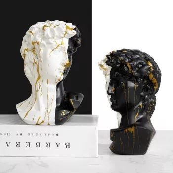
If the goal is a shelf piece that looks curated instead of filler, Luxury Black and White Gold David Statue delivers a statement-ready mix of monochrome impact and polished gold detailing. It’s designed to read as modern décor while still carrying that gallery-reference aura.
- Bold black/white base with gold accents for a contemporary, design-forward finish.
- Fits naturally as a centerpiece on coffee tables, entry consoles, and office shelving.
- A strong gift choice for art lovers, apartment stylists, and anyone building a “collected” look.
- In stock at $35.67.
Quick Specs
Where to Place It for Maximum Impact
This kind of piece performs best when it gets a little breathing room and a clear sightline. Think “moment,” not “miscellaneous.”
- Entryway: Set it on a narrow console with a mirror behind it to bounce highlights and increase presence.
- Living room: Anchor a shelf vignette with stacked books plus one contrasting object (glass, stone, or matte ceramic).
- Bedroom: Style it on a dresser near a tray so the surface reads intentional rather than cluttered.
- Office: Place it slightly off-center on a credenza to balance a lamp, monitor, or framed print.
- Dining area: Use it on a sideboard with one tall element to create a clean vertical counterpoint.
Styling Principles: Scale, Grouping, and Negative Space
The easiest way to make a small sculpture feel “designer” is to treat it like art: give it structure, not noise.
Lighting Tricks That Make Gold Details Glow
Care and Handling for a Polished Finish
Design Pairings: Complementary Pieces for a Cohesive Corner
- Add a sculptural overhead piece—like the Handmade Wabi Sabi Rattan Pendant Light—to bring an art-forward feel into dining areas, entries, or reading nooks.
- Introduce organic texture nearby (woven, rattan, linen) to soften the crisp black-and-white contrast.
- Keep the supporting cast minimal: one tray, one book stack, one vase—so the statue remains the hero.
- Match metals with restraint: gold looks strongest when repeated once or twice, not everywhere at once.
FAQ
Does a David-inspired statue work in modern décor?
Yes. A monochrome-and-gold finish makes the classical form feel current, especially when paired with clean-lined objects and plenty of negative space.
How should it be displayed on a shelf without looking cluttered?
Use a simple three-item grouping (statue + books + one taller object) and avoid lots of small décor competing for attention. Leaving open space around the silhouette is what makes it look curated.
How can gold accents be coordinated without overdoing it?
Repeat gold once or twice elsewhere—like a frame or lamp—and keep the rest of the metals consistent (or intentionally contrasting, such as black metal). The goal is echo, not overload.
Recommended for you











Leave a comment